Interface
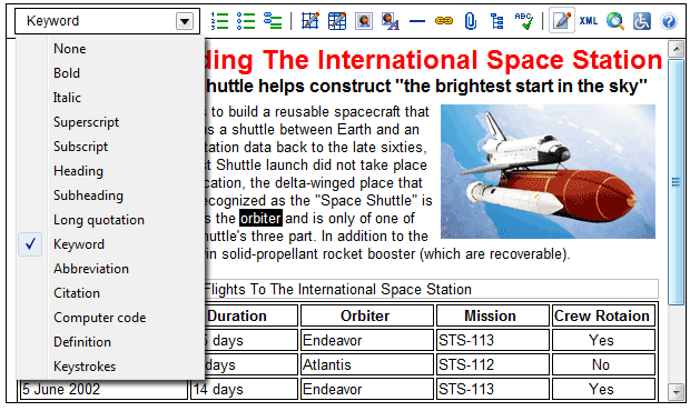
The editor's toolbar is the primary means of accessing the editor's functionality. The screen shot below shows XStandard with the drop-down Styles menu extended on the toolbar.
XStandard's toolbar is flexible and highly customizable. Buttons can be shown, hidden or re-arranged. Existing icons can be modified or new buttons added. See the Toolbar Customization section of this document for instructions. If necessary, XStandard's toolbar can also be hidden entirely and replaced by a different toolbar that communicates with the editor through its API.
The editor has 4 modes of operation (Edit, View Source, Browser Preview and Screen Reader Preview). Different toolbar buttons are available on the toolbar in each mode, as described in the following sections.
Edit Mode
The Drop-down Styles Menu| Toolbar Function | Description |
|---|
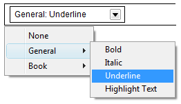 | Styles menu - Business users format content by selecting from a drop-down menu of style options. The Styles Menu list is customizable and styling options typically reflect the type of document being edited. This greatly simplifies the authoring process and ensures consistency of presentation. User-friendly names in the Styles menu carry instructions for the type of element and attribute(s) to be created. In our example, selecting "Bold" creates a <strong> tag. Selecting "Underline" creates a span tag with a class called "underline": <span class="underline">. Styles appearing in the Styles Menu are defined in an XML document that the editor reads when it is started. More information is available under the Styles section. |
Default Toolbar Buttons In Edit Mode| Toolbar Function | ID | Description |
|---|
 | ordered-list | Numbered list - This button creates an ordered list of sequentially numbered items. |
 | unordered-list | Bulleted list - This button creates an unordered list of bulleted items. |
 | definition-list | Definition list - This button creates a definition list which can be used to author a glossary of terms, to present dialog, or other associated content. |
 | draw-layout-table | Draw layout table - This button is used to graphically specify the dimensions of a layout table. |
 | draw-data-table | Draw data table - This button is used to graphically specify the dimensions of a data table. |
 | image | Image - This button is used to insert images. Users can enter a specific URL where the image can be found, browse a library of images, or select an image from their local computer. |
 | images-as-text | Show images as text - This button displays alternate text in place of images so that alternate text can be seen and edited in the document. |
 | separator | Separator - This button inserts a content separator. By default, this renders as a line. |
 | hyperlink | Hyperlink - This button is used to insert or edit hyperlinks (or anchors). The button is active only when text or an image is selected. |
 | attachment | Attachment - This button is available in the Pro version of XStandard, and is used to browse attachment libraries.The button is active only when text or an image is selected. |
 | directory | Directory - This button is available in XStandard Pro. It is used to browse third-party sytems such as a CMS and inserts code snippets into the editor. |
 | spellchecker | Spelling - This button spell-checks the contents of the editor and is available in XStandard Pro. |
 | wysiwyg | Edit - Changes the editor's view to Edit (WYSIWYG) mode. |
 | source | View source - This button displays the XHTML source code of content managed by the editor. |
 | preview | Browser preview - This presents the editor's content as IE would display it. |
 | screen-reader | Screen reader preview - This displays content managed through the editor as a screen reader would process it, in linear fashion. This feature gives authors opportunities to review and optimize content for greater accessibility. |
 | help | Help - Opens a new window containing end-user documentation for the editor. |
Additional Toolbar Buttons In Edit Mode| Toolbar Function | ID | Description |
|---|
 | strong | Bold |
 | em | Italic |
 | cut | Cut |
 | copy | Copy |
 | paste | Paste |
 | sub | Subscript |
 | sup | Superscript |
 | underline | Underline - By default, this button creates the markup: <span class="underline">. This markup can be customized. |
 | strikethrough | Strikethrough - By default, this button creates the markup: <span class="strikethrough">. This markup can be customized. |
 | undo | Undo |
 | redo | Redo |
 | blockquote | Add long quotation- This button identifies content as a quotation. By default, the text is formatted as a block, and justified to left and right. |
 | undo-blockquote | Remove long quotation - This removes a long quotation. |
 | align-left | Align left- By default, this button creates the markup: <p class="left">. This markup can be customized. |
 | align-center | Align center- By default, this button creates the markup: <p class="center">. This markup can be customized. |
 | align-right | Align right- By default, this button creates the markup: <p class="right">. This markup can be customized. |
 | textbox | Text box - By default, this button creates the markup: <div class="textbox"><h5>{heading}</h5><p>{text}</p></div>. This markup can be customized. |
 | photo | Photo - By default, this button creates the markup: <div class="photo"><p class="photo"><img width="100" alt="" height="150" src="images/placeholder.gif" /></p><p class="photo">{caption/credit}</p></div>. This markup can be customized. |
 | open-document | Open document - This button provides a hook for custom programming by generating an event. |
 | save | Save document - This button provides a hook for custom programming by generating an event. |
 | new-document | New document - This button provides a hook for custom programming by generating an event. |
 | print | Print - This button provides a hook for custom programming by generating an event. |
 | properties | Properties - This button provides a hook for custom programming by generating an event. |
 | wizard | Wizard - This button provides a hook for custom programming by generating an event. |
 | layout-table | Create layout table - This creates a table used for visual layout rather than for presenting data. Layout tables are typically used to arrange images and text to achieve a more pleasing visual effect. |
 | data-table | Create data table - This button creates a table used for presenting tabular data. An example would be a bus schedule or an expense report. Data tables typically have row and/or column headings and the data inside the table is read and understood in relation to the headings. |
 | copyright | Copyright symbol |
 | euro | Euro symbol |
 | pound | Pound symbol |
 | registered-trade-mark | Registered trade mark symbol |
 | trade-mark | Trade mark symbol |
 | yen | Yen symbol |
 | expand | Expand - This button is used to open the editor in a larger window. Currently, this functionality is only available in the Windows version of the editor. |
 | find-replace | Find / replace |
View Source Mode
Default Toolbar Buttons In View Source Mode| Toolbar Function | ID | Description |
|---|
 | indent | Indent - This button inserts a TAB character. |
 | whitespace | Show whitespace - This button toggles the show whitespace feature on/off. When enabled, the editor will render a marker in place of whitespace characters such as soft spaces and tabs. |
 | word-wrap | Word wrap - This button toggles the word wrap feature on/off. |
 | dim-tags | Dim tags - This button toggles the dim tags feature on/off. When enabled, the editor will dim or gray out markup characters in order to make it easier to read content. |
 | validate | Validate - This button is used to check if the markup is well formed according to the rules of XML. |
| | wysiwyg | Edit - Changes the editor's view to Edit (WYSIWYG) mode. |
| | source | View source - This button displays the XHTML source code of content managed by the editor. |
| | preview | Browser preview - This presents the editor's content as IE would display it. |
| | screen-reader | Screen reader preview - This displays content managed through the editor as a screen reader would process it, in linear fashion. This feature gives authors opportunities to review and optimize content for greater accessibility. |
Browser Preview Mode
Default Toolbar Buttons In Browser Preview Mode| Toolbar Function | ID | Description |
|---|
| | wysiwyg | Edit - Changes the editor's view to Edit (WYSIWYG) mode. |
| | source | View source - This button displays the XHTML source code of content managed by the editor. |
| | preview | Browser preview - This presents the editor's content as IE would display it. |
| | screen-reader | Screen reader preview - This displays content managed through the editor as a screen reader would process it, in linear fashion. This feature gives authors opportunities to review and optimize content for greater accessibility. |
Screen Reader Preview Mode
Default Toolbar Buttons In Screen Reader Preview Mode| Toolbar Function | ID | Description |
|---|
| | wysiwyg | Edit - Changes the editor's view to Edit (WYSIWYG) mode. |
| | source | View source - This button displays the XHTML source code of content managed by the editor. |
| | preview | Browser preview - This presents the editor's content as IE would display it. |
| | screen-reader | Screen reader preview - This displays content managed through the editor as a screen reader would process it, in linear fashion. This feature gives authors opportunities to review and optimize content for greater accessibility. |
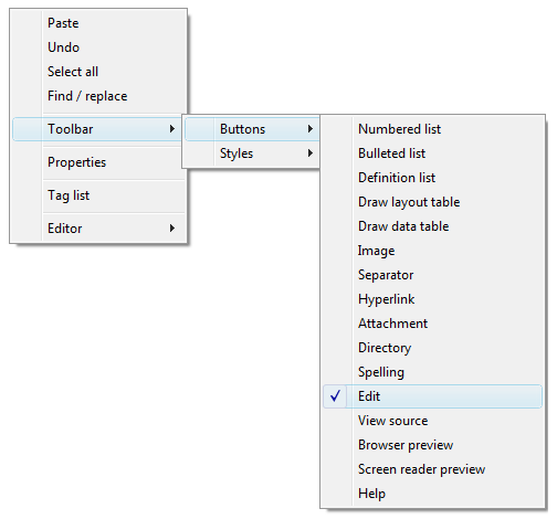
XStandard's interface provides context-sensitive pop-up menus, or "context menus". These menus are accessed by right mouse clicks, by SHIFT+F10 on Windows or CTRL+SPACE on OS X.
The functionality of the toolbar is fully accessible using a keyboard, through the context menu:
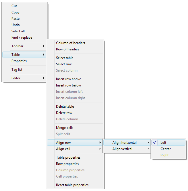
The context sensitive context menus provide access to a lot of functionality . The screen shot below shows table editing features available via the context menu.